Windows 8 Preview – Test Drive
I’m pretty excited about Windows 8. Just downloaded the preview edition from http://msdn.microsoft.com/en-us/windows/apps/default.
Ribbon UI
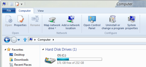
For starters, the build includes the Ribbon UI to replace those old Windows 95 dropdown menus. Although, it takes a little time relearning the locations of your favorite menu items, it really does speed up the rate at which you can traverse the menus. Instead of clicking through menus and submenus, you can simply look up at the items with icons to locate your option. To move to the next item, simply use the scroll wheel on your mouse.
Decreased Boot Time
Now I was a little skeptical…after watching the Microsoft keynote online, a Windows machine booting in 8 seconds seemed a little optimistic. To be honest, the OS does boot quicker than Windows 8, but takes around 15 seconds. I’m sure if I installed Windows 8 on my SSD, the boot times would quickly increase.
Spanning Wallpaper
One statistic I heard long ago was a second monitor increases your productivity by 15%. I’ve been hooked ever since my first day on the job. In Windows XP, I could download a desktop wallpaper that fit the width and height of 2 monitors side by side and then tile to show the whole image across both. It was really cool when a nice, high-resolution, panoramic picture could be completely displayed without distortion. My website of choice for all desktop backgrounds (with the exception of Windows 7 themes which I get straight from Microsoft) is http://interfacelift.com. Windows added a new Picture Position dropdown option called Span which is available in the Desktop Background section of the Personalization Control Panel. My advice is to match the dimensions exactly for no distortion.

Hyper-V
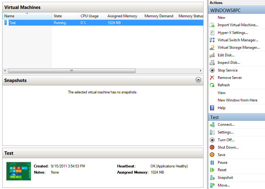
One feature which I highly support is the built-in virtualization. Windows 8 now supports running Hyper-V virtual machines. Previously, only Windows Server 2008 could successfully deploy virtual machines with limited options, but Windows 8 also includes a Virtual Storage Manager for those who want to natively support fiber connections. Dynamic memory is supported out of the box (Service Pack 1 enables this functionality in Server 2008 R2).
Revamped Task Manager
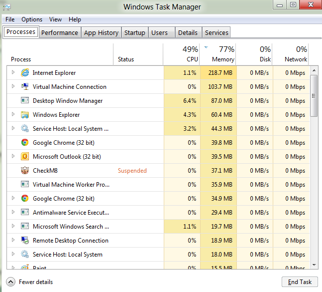
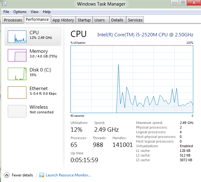
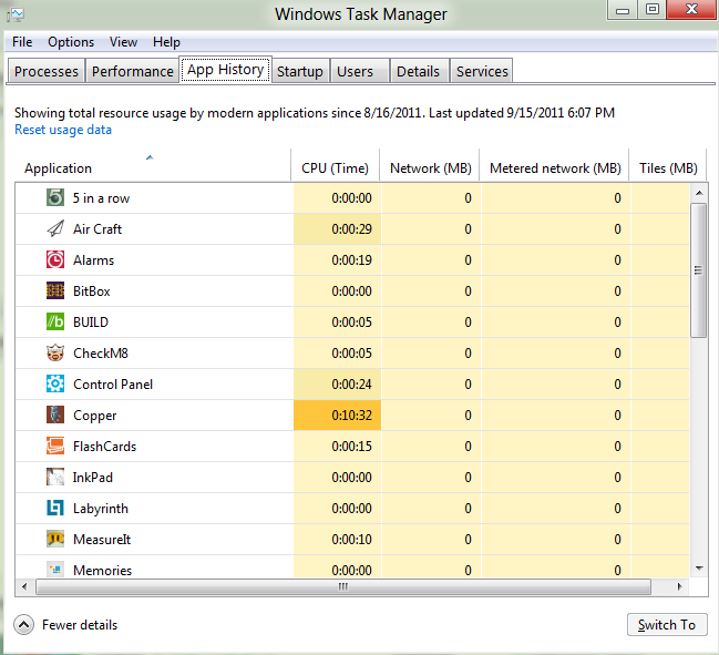
I can’t count the number of times the original Task Manager failed to provide me with enough information about the running processes, performance, etc. I usually download Process Explorer from the SysInternals Suite, a collection of software tools written by Russian hackers which Microsoft decided to buy, and use that as my default Task Manager. You can download it here: http://technet.microsoft.com/en-us/sysinternals/bb896653. The latest version of Windows Task Manager breaks down the CPU, Memory, Disk, and Network usage into color coded categories so you can see exactly how much life each process is utilizing. The child processes are also grouped together under their parent processes to show how each application called another. The Performance tab was also modified to clearly show the throughput, utilization, and current state of the CPU, memory, disk, and network connections (all color coded). In order to see the traditional separate graph for each core, double click on the CPU graph name and then right click -> Change Graph To -> Logical Processors (little tricky). The App History tab stakes the place of the Recent Programs column in the start menu with a listing of how long the application was running and how much data was passed through the network. The Startup tab provided a simpler alternative to MSCONFIG with an easy right-click to disable or view file properties. Skipping over the Users and Details tab, the final Services tab allows you to see the status of every service and to quickly restart any of them. Excellent tool.
Metro UI
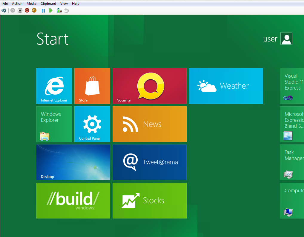
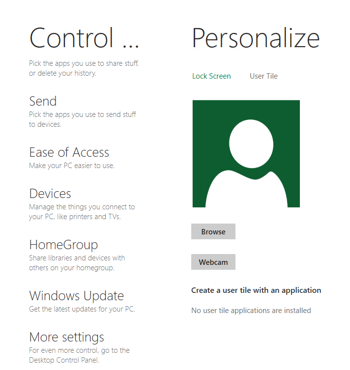
The biggest difference in Windows 8 is the integration of the touch favored interface, Metro UI. At first glance, Metro is very simple and plain. The UI is basically a single color background with white font and lacks a permanent menu bar. Although plain, the products of many big players on the digital front have moved in the same direction. Google has always been a simpleton when it came to design. The original Google search homepage was nothing more than a logo, textbox, and two buttons which was the key for the greatest search engine on the planet. Facebook, although full of content, also operates from a similar UI. If you look past all the new feeds, applications, and advertisements, you see a simple blue banner up top with a few tiny icons and whitespace on the rest of the page. Metro UI does an amazing job at presenting information in an easy to read, easy to navigate format. A slew of options from the Control Panel (while still available in the traditional desktop Control Panel) have been ported over to a Metro UI app called Control Panel. No menus or dropdown lists. Just point, click (or touch), set! The Metro UI is designed for touch support (which is full of fluid motion and transitions) so using a mouse is a little of a disadvantage, but the touchpad on a laptop probably won’t cut it. I found that using Ctrl and the Arrow keys was the best way to navigate the Metro UI on a laptop.
Dual Desktops (more like One Desktop with an UI layer on top)
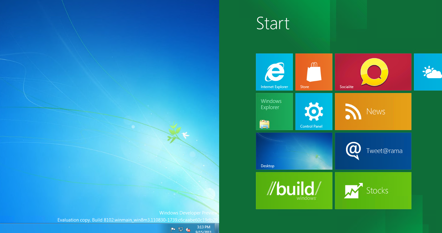
The best way for me to describe the integration of the Metro UI: picture the Windows 7 desktop (without the Start Menu) and by pressing the Start button, you’re requesting the Metro UI to slide onto your screen. There is no drag and drop support between the two different desktops. Since there is no Start Menu, I instead choose to “pin” my application shortcuts onto the Metro UI desktop and when clicked, the Metro UI automatically slides out of the way, displays the traditional Windows desktop, and then runs the application with 100% compatibility. All Windows 7 applications are fully supported in Windows 8 probably because there were not many changes to the underlying structure of the operating system.
Desktop to Web
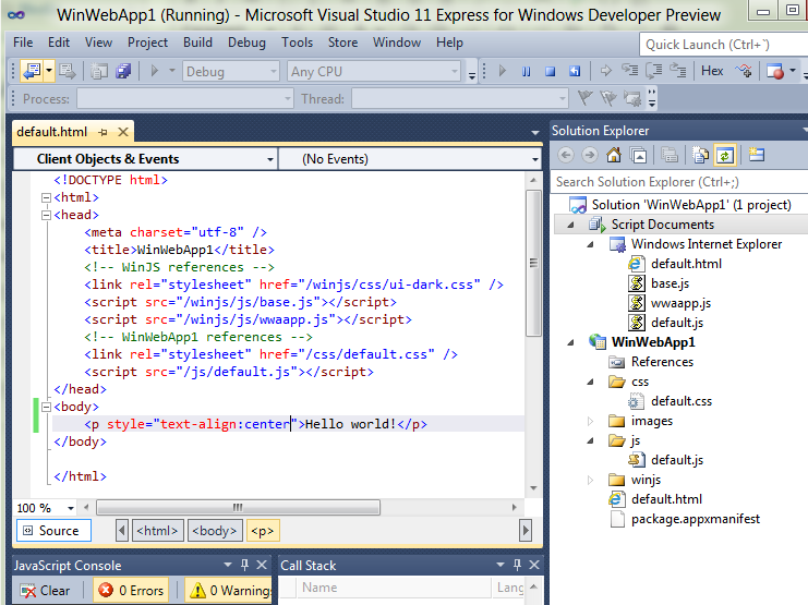
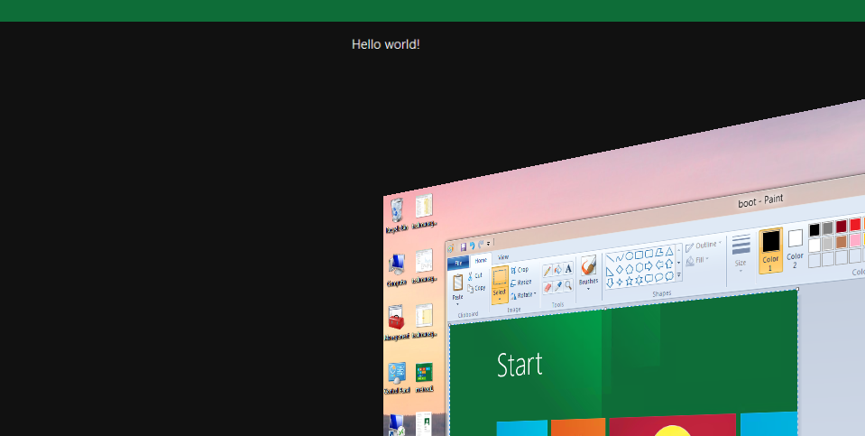
I downloaded the Developer Preview version of Windows 8 which included Visual Studio 11 Preview. VS11 allows you to create Metro style applications from your existing .NET applications by changing a few lines of code. To my surprise, the Metro UI framework is primarily web based. Think about it. If you want to develop an application that runs on many different platforms, which languages are supported by every OS? The web languages. If you open up a new Metro UI project in Visual Studio, you will be greeted by HTML, CSS, and JavaScript. You can basically copy and paste a webpage into the Visual Studio project, click Run, and the app will automatically appear on the Metro UI. Simple. What’s better? Any application written for Metro UI will be supported by every desktop, laptop, tablet, and mobile device running Windows 8. My one issue is when you click the Start button or Windows key (same effect) to leave a Metro UI app for the Metro Desktop, the application status changes to Suspended in the taskbar, but holds on to the ram. I don’t like applications running in the background (it’s a control thing) so the only way I found to close them is to use the Task Manager. I’m not sure if this was part of Microsoft’s plan, but this is one feature of the new OS I dislike (Android does the exact same thing and it bothers the heck out of me). If I want to close an app, it should be easy to close.
Missing the Start Menu
I’ve used the start menu for over 15 years now and I’m definitely going to have trouble letting go. (By the way, Microsoft: PLEASE PLEASE PLEASE dissolve the registry next and go back to a file intensive backend like Linux - one corruption in the entire registry and the computer will not boot, just a suggestion). The Metro UI is designed to replace your start menu with an easy to navigate and searchable interface. After you click the new start button, simply click on the application if it is pinned to your Metro UI or start typing the name of the application to bring up a Metro styled application interface that will help you find what your looking for. I’m currently using Windows 8 Preview as my primary computer so I’ve caught myself more than once trying to click for an item in my start menu that is now in a completely different place. I’ve created a few desktop shortcuts, but I believe Microsoft is trying to move everyone over to using the Metro UI predominantly as a full desktop environment and use the traditional Windows desktop as more of a workspace.

Overall
I started on 95, loved 98 SE, hated ME, skipped 2000, relied on XP, forgot about Vista, and breathed 7. Windows 8 will be great because its built on the stability of Windows 7 and will thrive on web technology for productivity. For the young generation of users, the Metro UI will support their social lifestyles while the older generations may find Metro easy to navigate if they are using a tablet. I support innovation so as tablets consume the market, I hope Windows 8 will be there to provide a solid operating system for many different types of users and devices.
Thanks for reading!